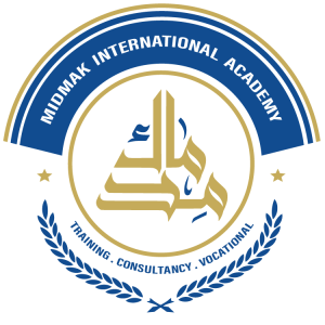
Midmak International Academy Logo
Conceptual Significance of the Logo
- Lexical Significance:
The term Midmak refers to a structural course in construction; it is the guiding line stretched between two points to ensure the straightness of a wall from beginning to end, thereby guaranteeing structural balance and precision. It thus represents the foundation, the reference, and the disciplined methodological path upon which an integrated structure is built. - Interpretive Significance:
Within the context of learning and professional qualification, Midmak symbolizes:
An integrated system of knowledge and skills that forms the cornerstone in building an individual’s professional identity, enabling the acquisition of competence and performance proficiency through progressive training pathways that begin at foundational levels and advance toward excellence and professional mastery. - Philosophy Behind the Name Selection:
The name Midmak was chosen to embody a conceptual framework reflecting the Academy’s vision of:
Building individuals through a sustainable knowledge-based methodology, grounded in establishing a solid foundation of capabilities, developed through a set of core pillars, namely: - Rationalization .
- Structuring .
- Formation .
- Skill Development .
- Professionalization .
- Re-engineering (Skills Re-engineering) .
This approach ultimately leads to the development of professional and cognitive competencies based on solid and sustainable scientific foundations.
Logo Components
- The Word (Midmak):
The word Midmak is rendered in an artistic geometric Arabic script designed by the visual artist Reem Qubtan.
It adopts a pyramidal geometric form that reflects the concept of progressive construction from the base to the peak, aligning with the Academy’s philosophy of gradual advancement toward professionalism.
The visual design was completed and the color scheme selected by KeylnHands.
- The Golden Circular Frame:
The circular frame represents:
- Integration and harmony .
- Continuity and infinity .
- Institutional and methodological coherence .
It also reflects that the Academy’s operational system is governed by clear quality standards that regulate and structure performance without restricting creativity and innovation, allowing each individual to build their own pathway according to their goals and capabilities.
- The Two Wheat Ears:
The logo is surrounded by two blue wheat ears symbolizing:
- Continuous giving .
- Renewed harvest of achievements .
- Sustainable professional growth and development .
Color Significance of the Logo
- Golden Color:
Symbolizes:
- Knowledge and intellectual growth .
- Success and achievement .
- Wisdom and creativity .
- Strength and prosperity .
It reflects the state of excellence and distinction that the Academy seeks to instill in its members, enabling them to become influential, competent, and capable leaders.
- Indigo Blue Color:
Represents:
- Trust and professionalism .
- Wisdom and awareness .
- Internal stability and discipline .
- Future vision .
It reflects the balance between theoretical knowledge and practical application, while reinforcing professional values such as integrity and responsibility.
- White Color:
Used in writing the name in English, symbolizing:
- New beginnings .
- Purity and clarity .
- Mastery and perfection .
It represents the Academy’s outcomes in preparing individuals with refined, distinguished, and sustainable knowledge structures.
Overall Symbolic Summary of the Logo
The logo of Midmak International Academy embodies a comprehensive model for human development. It reflects a cumulative scientific methodology that begins with knowledge foundation, progresses through skill development, and ultimately leads to achieving professional competence and sustainable excellence.
Vision
Guiding, structuring, forming, equipping, and professionalizing individuals and institutions, while building sustainable competencies and capacities. Our aim is to achieve efficiency within the local and Arab knowledge-based economy.
Mission
To lead in sustainable vocational qualification through global quality standards that meet the future vision of the Arab world, achieving sustainable development of human resources in alignment with local, Arab, regional, and global labor markets.
Values
- Leadership and Excellence: Innovative competency programs across various sectors.
- Quality: High-quality training and qualification programs.
- Commitment: Full commitment to all agreements and obligations we undertake.
- Innovation: Employing global training approaches.
- Professionalism and Competence: Demonstrating knowledge, skill, and proficiency in specialization.
- Mastery: Performing all tasks with a high degree of precision to meet quality standards and achieve the desired excellence and leadership.
- Continuous Learning: Fostering a culture of continuous self-learning to renew scientific knowledge and develop professional skills, contributing to the building of a sustainable, pioneering knowledge economy.
- Integrity and Academic Honesty: Upholding credibility, objectivity, and respecting intellectual property rights.
- Transparency and Accountability: Institutional engagement with transparency and responsibility, following a clear evaluation and accountability mechanism.
- Collaboration and Partnership: Engaging in community participation and responding to the needs of beneficiaries through fostering local, Arab, and international partnerships and collaborations.
- Sustainability: Ensuring the sustainability of capacities and skills to achieve performance and productivity efficiency at all levels.
- Social Responsibility: Supporting initiatives and training programs aimed at empowering individuals to access training, develop skills, and raise awareness and personal capabilities, particularly initiatives targeting women and children.